Last Updated on January 8, 2026
Why Your Business Doesn’t Need All the Bells & Whistles
Are you thinking about building a new website? Or maybe overhauling an old one?
It’s easy to get caught up in the hype. Everyone wants the latest animations, parallax scrolling, AI chatbots, and a design that looks like it cost a million bucks.
But what if I told you that for most small businesses and non-profits, all those bells and whistles are just digital noise? They’re the empty calories of the web, distracting your visitors and bogging down your message.
My philosophy teaches one thing: clarity always trumps complexity.
Your website isn’t a trophy; it’s a tool. And like any good tool, it should be simple, efficient, and effective at its job.
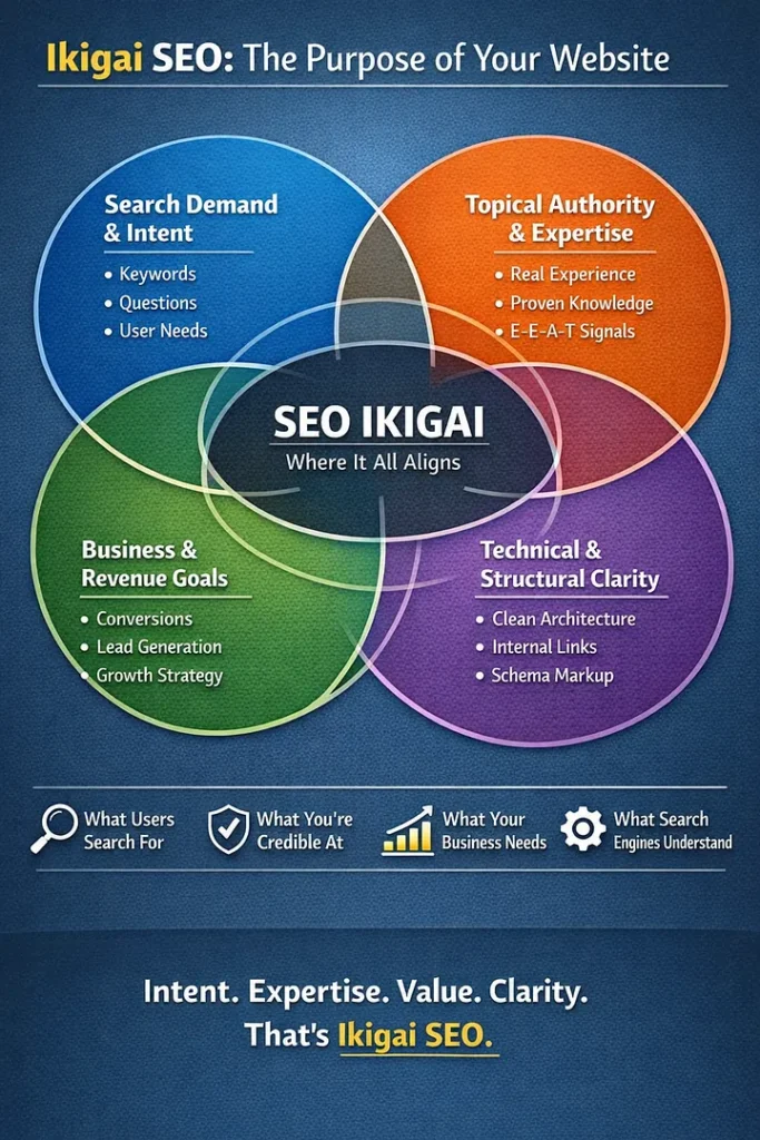
Most SEO strategies start with “Can we rank for this keyword?” Wrong question. With GEO search, the real question is: “Why should we rank at all?” That’s where Ikigai comes in – your content’s reason for being.
The Problem: “Feature Bloat” and Digital Overwhelm
I’ve seen it countless times in my 25+ years in the digital trenches. Clients come to me, their eyes glazed over, explaining all the “must-have” features they’ve seen on competitors’ sites.
- “We need a custom animation when the user scrolls!”
- “Can we have a pop-up that dances across the screen?”
- “Our services page needs 10 different accordions and tabs!”
The result? A website that’s slow, confusing, and ultimately, ineffective. It takes forever to load, frustrating visitors and obscuring the very message you’re trying to convey. It’s like trying to have a conversation in a room full of shouting people.
The Solution: Embrace the Zen of a Simple Website
Think about the best tools you own. A sharp knife, a sturdy hammer, a reliable pen. They do one job, and they do it well, without unnecessary complexity.
Your website should be the same.
A simple website is:
- Fast: It loads quickly, keeping impatient visitors from bouncing away.
- Clear: Your message is front and center. What do you do? Who do you help? How can they get in touch?
- Easy to Navigate: Visitors can find what they need without a treasure map.
- Mobile-Friendly: It works perfectly on any device, from a desktop to a smartphone.
- Focused: It guides your visitor towards a specific action, whether it’s making a purchase, signing up for a newsletter, or calling you.
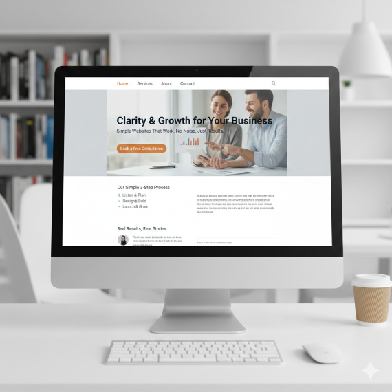
Here’s a visual representation of what a focused, simple website aims for.
This image shows a clean, modern website design on a desktop monitor, emphasizing clarity and ease of use over flashy elements.
Proof: Why Simpler is Smarter
- User Experience (UX): People respond positively to clarity. If your site is easy to use, they’ll stay longer and convert more often. Confuse them, and they’ll leave.
- Search Engine Optimization (SEO): Google loves fast, mobile-friendly sites with clear content. A simple structure makes it easier for search engines to understand what your site is about, boosting your chances of ranking.
- Maintenance & Cost: Less complexity means less to break, fewer updates to manage, and often lower development costs.
- Your Message: When you strip away the fluff, your core message shines through. This helps you build trust and authority (think E-E-A-T!).
Your Action Plan: Three Steps to a Simpler Site
Ready to declutter your digital presence? Here’s how:
- Define Your Core Goal: What’s the ONE thing you want visitors to do when they land on your site? Call you? Buy a product? Sign up for a newsletter? Make everything on your site support that goal.
- Strip Away the Superfluous: Go through your current site (or your ideas for a new one). For every element, ask: “Does this directly help my visitor achieve my core goal, or does it add confusion?” If it’s the latter, get rid of it.
- Prioritize Speed & Mobile: Use tools like Google PageSpeed Insights to check your site’s performance. Ensure every page looks and functions perfectly on a smartphone.
Don’t let the digital noise convince you that bigger, flashier, or more complex is always better. For your business, clarity and simplicity are your greatest assets online.
Hot Tip! Catch me over on Twitter/X and let’s talk about websites, SEO, and all things Digital Marketing: https://x.com/WarrenLNaida
Further Reading
Your fancy website might actually be costing you business. Over-designed sites slow users down, confuse navigation, and kill conversions. Simple websites load faster, rank better on Google, improve accessibility, and even reduce carbon impact.
Simplicity isn’t boring – it’s a power move. Stop decorating. Start communicating.