Last Updated on March 24, 2025
- Some Tips to Help Your Website Dress to Impress
- The Best Way to Keep People Interested in Your Website
- 6 Ways Your Website Can Make a Good First Impression
- Website Improvement Tip #1: Avoid Putting Everything on Your Website
- Website Improvement Tip #2: A Fast Website is a Lean Website: Put Your Website on a Diet
- Website Improvement Tip #3: Unclutter Your Website and Embrace Negative Space
- Website Improvement Tip #4: Use Images and Colours to Grab Hold of Your Visitors
- Website Improvement Tip #5: Is the Purpose of Your Website Clear? Test Yours with The 5 Second Rule
- Website Improvement Tip #6: An Accessible Website is More than a Responsive, Mobile Website
- What’s Your Opinion? What Makes a Good Website?
Some Tips to Help Your Website Dress to Impress
A website is a place on the internet where we can find or provide information, or conduct transactions – social, or business. You’re reading this article on a website right now, in fact.
There are a lot of websites on the internet – more than 1 billion of them according to Forbes (Feb 14 2023). If we visited ten websites a day, it would take us almost 300 years to visit each of them.
Visiting each website, if you could find them all (Google only has about 6% of the internet indexed) would still be an easier task than watching every movie ever made (circa 40 000 years) or reading every book ever written (circa 80 000 years). We would probably lose interest after the first hundred years anyway.
So, what can we do to keep people interested, and glued to our website?
The Best Way to Keep People Interested in Your Website
The success of a website is usually dependent on two things: usability and utility. User Experience (UX) and the User Interface (UI) of a website are as interesting to web designers and accessibility experts as they are to Google.
The easier we can use a website, and the faster we find what we are looking for, usually decides how much time we spend on the website. The longer we spend on a website is a signal that we have found what we were looking for and that we enjoy using the website.
So, make your website easy to use, make it useful, and make it interesting.
How long does it take for us to decide to stay? That depends on who you ask.
Some sources say 5 seconds; some sources say 10 seconds (Nielsen Norman Group). If a website doesn’t load quickly enough, or if we are hampered in any other way in accessing the website (popups etc.), we could leave within 3 seconds – according to some other sources (Forbes).
That’s an incredibly short length of time to make a decision. Fun Fact: The average amount of time people look at a restaurant menu before ordering is 109 seconds. (source: Webstaurantstore.com) The average time for people, on average, to fall in love is 111 days. (source: New Scientist)
How long will users stay on a web page before leaving? It’s a perennial question, yet the answer has always been the same: Not very long.
https://www.nngroup.com/articles/how-long-do-users-stay-on-web-pages/
6 Ways Your Website Can Make a Good First Impression
Website Improvement Tip #1: Avoid Putting Everything on Your Website
It’s natural to want to show visitors what we can do for them. It’s natural to want to show them what we’ve done for others. Our website took a lot of time to put together, and we are proud of our work. However, your website is not your Mum’s fridge. Avoid putting everything on your site. It’s better to focus on specific needs.
Think about creating Landing Pages for specific purposes instead of offering too much on each page. A huge choice of content is great if you’re standing in front of a buffet, but not so good if you’re holding a mobile phone.
Unsure whether your website is too cluttered? Try this:
- Open your website
- What’s the first thing that grabs your attention?
- Is that item CORE to your website or message? No? Remove it.
Movie buffs will remember this unclutter technique from the 1991 Steve Martin movie LA Story.
Website Improvement Tip #2: A Fast Website is a Lean Website: Put Your Website on a Diet
Speed wins. Fast websites load fast, however, websites today are at least four times as large as they were ten years ago. Twenty years ago, the average website weighed about 500 Kb. Today they average about 2MB. I’m not pointing fingers. This website weighs 1 MB.
Page builders, plugins, huge images, videos, animation, CSS and Javascript libraries all add to the bulk. It’s pretty ironic if you think about it. We’re so fitness conscious at the moment, and yet our websites are bloated with junk. A website works just fine with HTML and a little CSS. It’s just a fucking website after all.
How much does your website weigh? You can check your website weight right here: https://tools.pingdom.com/ Is there too much website there? You might benefit from an optimizer plugin that compresses your images, HTML, CSS, and other sundry items.
This website uses WP Optimize and I find it works really well. Best practise, however, is to simply optimise images before they are uploaded onto your website, and to avoid bloat in the number of plugins, and the type of theme you use.
Website Improvement Tip #3: Unclutter Your Website and Embrace Negative Space
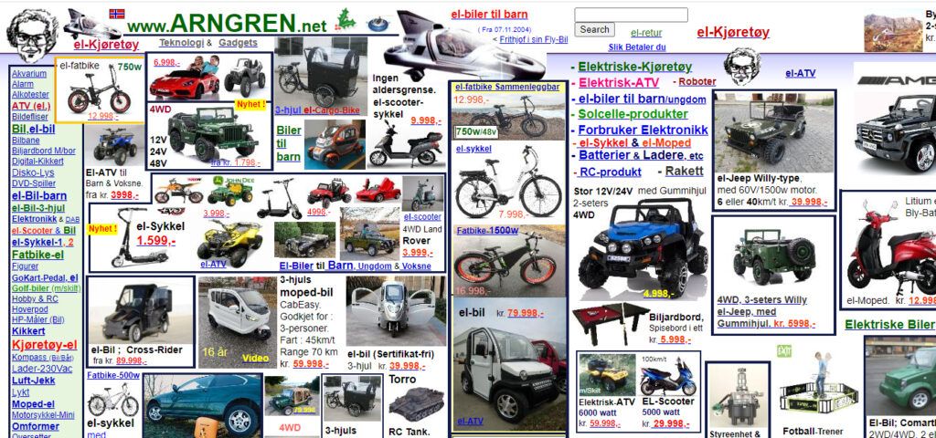
Anyone who has curated an exhibition knows that eyes require the right amount of light and space to fully appreciate what they are looking at. The same goes for reading and finding our way. Less is more. It’s a risky strategy that forces the visitor to guess where they have to go on your website. The way should be easily visible.
Mari Kondo might have decided to re-clutter, but that doesn’t mean we have to. Compare the two websites below. Where would you prefer to spend more time?


Website Improvement Tip #4: Use Images and Colours to Grab Hold of Your Visitors
Colours, symbols, and images are an essential part of our Storytelling. Why? They are packed with messages. Most banking and insurance websites feature a professional dark blue colour. Why? We trust that colour. It’s serious. Would you trust an insurance agent who showed up to your door wearing a lime green blazer and baby blue pants? Possibly not.
Colours and symbols also help guide our eyes to the right place – the contact form, the Call to Action button, or the next section of the text. Sometimes negative space – the purposeful use of white, empty space, does that – it piques our curiosity for what is coming next.
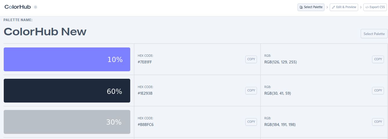
Using the 60/30/10 Colour Rule
The foundation for your website design is based on a primary colour – which could also be white – and this primary colour makes up 60% of your design.
The secondary colour, which makes up 30% of the colour scheme, is still noticeable and can be used for medium-sized components such as info boxes and cards.
Finally, the remaining 10% of the colour scheme is dedicated to the accent colour. This colour is reserved for important design elements, such as CTA buttons or other crucial points. This is your attention-grabber!
Try this out for yourself on ColorHub.

Website Improvement Tip #5: Is the Purpose of Your Website Clear? Test Yours with The 5 Second Rule
What is the purpose of your website? When was your website built? One year ago? Three? Five? Our businesses change over time. Take a look at your website to see if it still clearly represents what you do. Get some outside eyes too – remember: we aren’t our customers.
Unsure what your website does? Try this:
- Ask someone you don’t know (perhaps on the bus or waiting in line at the coffee bar) to look at your website.
- After 5 seconds (or ten if you prefer – you never know, this may be the beginning of a beautiful relationship) ask them to tell you what the website does. As in, what is the business?
- They should be able to tell you. If not, you have work to do.
It is easy for businesses to change their direction and focus. Does your website still represent your businesss? Does it feel right? Lately, I think my website is gorgeous of course but it may still be confusing. I’m thinking of a superminimalst design. Neve WordPress theme, keep my logo, black and white text. Simple. Clear. I already have a fast site thanks to Rocket.net now I want it to be minimalist.
Bridget Willard https://twitter.com/BridgetMWillard
Website Improvement Tip #6: An Accessible Website is More than a Responsive, Mobile Website
An accessible website is a website people can use. That’s it. Regardless of context. While it’s important that your website is accessible over a mobile phone, it’s equally important that visitors can use your website on a mobile phone.
Your website might be accessible according to the guidelines established by the WCAG, but your website may not be usable. Usability means the quality, satisfaction, and efficiency a person experiences when using your website.
Making Your Website Accessible for Everyone
What’s Your Opinion? What Makes a Good Website?
I asked this question on Twitter and got a lot of Answers! Here are some of them – and thank you!
Join that conversation: https://twitter.com/WarrenLNaida/status/1656695114792566784
Useful! @zetaraffix (my favourite answer!)
Gets to the point quickly, authentic, and fun!@PRwebcare
An intuitive interface strategy. @synapticsaga
Make it obvious what you do! @itssimondigital
Clear ‘what’s in it for me’ content. @ToolboxOfDesign
Has a single purpose. @EduSchwarzkopf
Great websites need great words. If people can’t read them, then they are useless. @BridgetMWillard
Clear objectives, messages, and ways to find the information the user is looking for. @marcoandrei
with many thanks for the image to https://www.bing.com/images/create/