Last Updated on March 24, 2025
- What Does Goldilocks Have to do with Content Creation?
- Keeping Content Simple Has Many Benefits
- Simple solutions have many advantages
- Simplicity generates better user experiences
- 9 Ways You Can Create Simpler and More Effective Website Content
- What Do You Think? Is Less More … or Less? Drop Me a Line
How it began.
Just like in the Goldilocks story, this post began with food. Not porridge though. Sushi. Sushi is so simple, and yet so packed with flavour, health, energy, beauty, history … so much in such a little package.
Japan has limited space and resources, so has over the centuries developed a culture of elegant simplicity, intelligent use of space, and ingenuity of design.
Sushi probably predates much of what we eat. You had raw fish, you had wild rice, maybe fire was some miles away, so you stuck the two together as you went.
There was limited access to GrabnGo alternatives five thousand years ago. Pizza delivery was six thousand years in the future. And you thought you had to wait a long time for delivery.
Twitter forces us to say a lot in a little space too – only a few hundred characters. The context of mobile phones (our movement, attention, and screen space) require information to be simple and direct.
Today you need to keep your message simple. People may not even see it, but if they do they’re probably on the go, busy looking at other content.
Images help when there is no time for words. Icons speak volumes, but even images need to focus on that one thing you’re trying to say. A picture is worth a thousand words, but people are only going to remember one or two of them.
What Does Goldilocks Have to do with Content Creation?
The Goldilocks principle, or rule, gets its name from the 19th century children’s story “The Three Bears” written by Robert Southey. If you don’t already know the story, it follows a young girl named Goldilocks who wanders through the forest one day. She stumbles across the house of the three bears. Luckily they are out for a walk when she shows up.
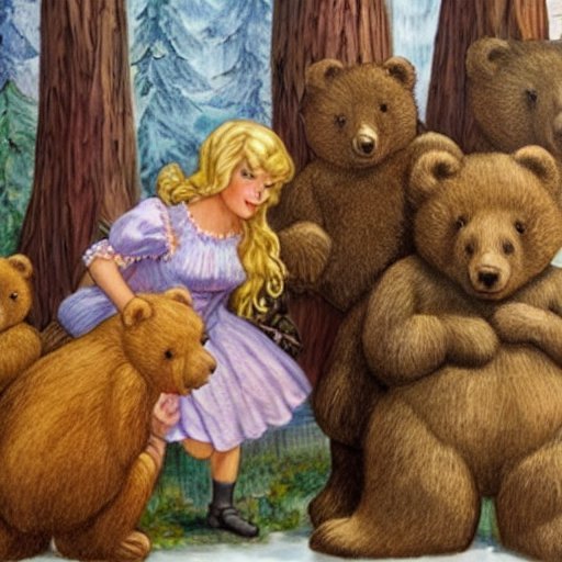
Goldilocks enters the house, and tries sitting on the three chairs and tasting the three bowls of porridge on the table. Papa bear’s is too hard and hot, Mama’s is too soft and sweet, but baby bear’s chair is just right as is his porridge so Goldilocks eats it all up.
After scoffing down the poor little bear’s food, she feels sleepy and goes into the bear’s bedroom, finding three beads. After trying them, she settles on the baby bear’s bed and promptly falls asleep just as the bears are returning.
The concept of “just the right amount” is easily understood and has been applied to a wide range of disciplines, including website and device UX and content creation.
Keeping Content Simple Has Many Benefits
Everyone knows the “KISS” principle. Keeping things short and simple. It’s the focus that is important. If we want people to remember our message and act on it, we can’t labour them with too much information.
Where do we see examples of this? Everywhere!
- + Complicated plays in football are reduced to simple numbers.
- + Hand signals in baseball speak volumes.
- + Acronyms, abbreviations, and jargon abound.
- + Icons and signs explain concepts with simple lines and colours.
- + Computer code consists of 1s ans 0s but is responsible for me being able to create this post and you being able to read it on your phone miles away.
- + The Eastern influences of yoga and meditation – uncluttering our minds
We see how effective focus is in our online marketing too:
- + In our SEO – focusing on few keywords per page and our paid ads
- + On our Websites – reducing our load speed with simpler themes, less code, andoptimised images
Simple solutions have many advantages
How does “just the right amount” benefit our business?
- + reduces marketing costs
- + reduces production costs
- + increases reach
- + reduces misunderstanding
When things are simple, they are easier to learn and remember.
When your content is filled with unnecessary information, it dilutes your message and takes attention away from your key points.
When your message is simple, it focuses attention on the important stuff.
Simplicity generates better user experiences
Simplicity can actually increase revenue of companies producing products along simple lines. IKEA is one good example. Whoever came up with the idea of the hotdog is another. Let’s not forget sushi, or pizza.
When Ford came up with his system to build cars on an assembly line, he was turning a complicated system (one person making something from start to finish instead of specialising on one aspect) into a simpler one.
From Apple to Chanel and Boss, Agile to DevOps, our complicated world is filled with ideas, designs, and methods that are remarkably successful because of their focus, and elegant simplicity. Below three perfect examples of “just the right amount”.


“Simplicity is about subtracting the obvious, and adding the meaningful.”
lawsofsimplicity.com
9 Ways You Can Create Simpler and More Effective Website Content
How can you use “just the right amount” to optimise your website and social media content?
- Use simple language: Write in a clear, concise and easily understood way.
- Use subheadings: Use enough H2s and H3s to break your content into sections and make it easier for people to scan and navigate your page.
- Keep your paragraphs short: Short paragraphs make your content easier to read and digest.
- Use lists: Breaking your content into bullet points can help people quickly scan your content and understand the key points. Google loves lists.
- Use visuals: Visuals such as images, videos or infographics can help break up your content and make it more engaging. Visuals keep people on your page longer too.
- Black text on a white background (positive text) is the easiest to read. White text on a black background (negative text) is almost as good.
- The highest-converting are bright primary and secondary colours — red, green, orange, and yellow.
- Tell stories: Use real-life stories or anecdotes to illustrate your points and make your content more relatable. People remember stories, they don’t remember instructions.
- Stay focused: Stick to the main point of your content. A focused message is easier to understand and remember. Write another post instead of diverging too much from the main point of your content.
If honesty and transparency in marketing are important to you… you’re going to love conversational copywriting.
This FREE Guide and 3 Videos from Nick Usborne will get you started down this new path.
https://conversationalcopywriting.com/free-guide/